引入
代码演示
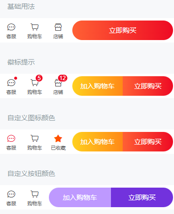
基础用法
徽标提示
在 GoodsActionIcon 组件上设置 `dot` 属性后,会在图标右上角展示一个小红点。设置 `badge` 属性后,会在图标右上角展示相应的徽标。
自定义图标颜色
通过 GoodsActionIcon 的 `color` 属性可以自定义图标的颜色。
自定义按钮颜色
通过 GoodsActionButton 的 `color` 属性可以自定义按钮的颜色,支持传入 `linear-gradient` 渐变色。
API
GoodsAction Props
| 参数 | 说明 | 类型 | 默认值 | |
|---|---|---|---|---|
| safe-area-inset-bottom | 是否开启[底部安全区适配](https://youzan.github.io/vant/v2/#/zh-CN/advanced-usage#di-bu-an-quan-qu-gua-pei) | boolean | true |
GoodsActionIcon Props
| 参数 | 说明 | 类型 | 默认值 | |
|---|---|---|---|---|
| text | 按钮文字 | string | - | |
| icon | 图标 | string | - | |
| color | 图标颜色 | string | #323233 | |
| icon-class | 图标额外类名 | any | - | |
dot 2.5.5 | 是否显示图标右上角小红点 | boolean | false | |
badge v2.5.6 | 图标右上角徽标的内容 | number / string | - | |
| info | 图标右上角徽标的内容(已废弃,请使用 badge 属性) | number / string | - | |
| url | 点击后跳转的链接地址 | string | - | |
| to | 点击后跳转的目标路由对象,同 vue-router 的 [to 属性](https://router.vuejs.org/zh/api/#to) | string / object | - | |
| replace | 是否在跳转时替换当前页面历史 | boolean | false |
GoodsActionButton Props
| 参数 | 说明 | 类型 | 默认值 | |
|---|---|---|---|---|
| text | 按钮文字 | string | - | |
| type | 按钮类型,可选值为 primary info warning danger | string | default | |
| color | 按钮颜色,支持传入linear-gradient渐变色 | string | - | |
| icon | 左侧[图标名称](https://youzan.github.io/vant/v2/#/zh-CN/icon)或图片链接 | string | - | |
| disabled | 是否禁用按钮 | boolean | false | |
| loading | 是否显示为加载状态 | boolean | false | |
| url | 点击后跳转的链接地址 | string | - | |
| to | 点击后跳转的目标路由对象,同 vue-router 的 [to 属性](https://router.vuejs.org/zh/api/#to) | string / object | - | |
| replace | 是否在跳转时替换当前页面历史 | boolean | false |
GoodsActionIcon Slots
| 名称 | 说明 | |
|---|---|---|
| default | 文本内容 | |
| icon | 自定义图标 |
GoodsActionButton Slots
| 名称 | 说明 | |
|---|---|---|
| default | 按钮显示内容 |
样式变量
组件提供了下列 Less 变量,可用于自定义样式,使用方法请参考
。
| 名称 | 默认值 | 描述 | |
|---|---|---|---|
| @goods-action-background-color | @white | - | |
| @goods-action-height | 50px | - | |
| @goods-action-icon-width | 48px | - | |
| @goods-action-icon-height | 100% | - | |
| @goods-action-icon-color | @text-color | - | |
| @goods-action-icon-size | 18px | - | |
| @goods-action-icon-font-size | @font-size-xs | - | |
| @goods-action-icon-active-color | @active-color | - | |
| @goods-action-icon-text-color | @gray-7 | - | |
| @goods-action-button-height | 40px | - | |
| @goods-action-button-warning-color | @gradient-orange | - | |
| @goods-action-button-danger-color | @gradient-red | - |
效果图: