介绍
用于在打开和关闭状态之间进行切换。
引入
代码演示
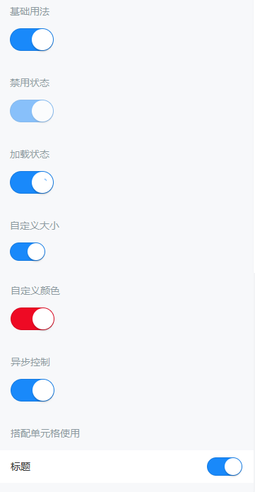
基础用法
通过 `v-model` 绑定开关的选中状态,`true` 表示开,`false` 表示关。
禁用状态
通过 `disabled` 属性来禁用开关,禁用状态下开关不可点击。
加载状态
通过 `loading` 属性设置开关为加载状态,加载状态下开关不可点击。
自定义大小
通过 `size` 属性自定义开关的大小。
自定义颜色
`active-color` 属性表示打开时的背景色,`inactive-color` 表示关闭时的背景色。
异步控制
需要异步控制开关时,可以使用 `value` 属性和 `input` 事件代替 `v-model`,并在 `input` 事件回调函数中手动处理开关状态。
搭配单元格使用
API
Props
| 参数 | 说明 | 类型 | 默认值 | |
|---|---|---|---|---|
| v-model | 开关选中状态 | any | false | |
| loading | 是否为加载状态 | boolean | false | |
| disabled | 是否为禁用状态 | boolean | false | |
| size | 开关尺寸,默认单位为px | number 、 string | 30px | |
| active-color | 打开时的背景色 | string | #1989fa | |
| inactive-color | 关闭时的背景色 | string | white | |
| active-value | 打开时对应的值 | any | true | |
| inactive-value | 关闭时对应的值 | any | false |
Events
| 事件名 | 说明 | 回调参数 | |
|---|---|---|---|
| change | 开关状态切换时触发 | value: any | |
| click | 点击时触发 | event: Event |
样式变量
组件提供了下列 Less 变量,可用于自定义样式,使用方法请参考
。
| 名称 | 默认值 | 描述 | |
|---|---|---|---|
| @switch-size | 30px | - | |
| @switch-width | 2em | - | |
| @switch-height | 1em | - | |
| @switch-node-size | 1em | - | |
| @switch-node-background-color | @white | - | |
| @switch-node-box-shadow | 0 3px 1px 0 rgba(0, 0, 0, 0.05) | - | |
| @switch-background-color | @white | - | |
| @switch-on-background-color | @blue | - | |
| @switch-transition-duration | @animation-duration-base | - | |
| @switch-disabled-opacity | @disabled-opacity | - | |
| @switch-border | @border-width-base solid rgba(0, 0, 0, 0.1) | - |
效果图: