引入
代码演示
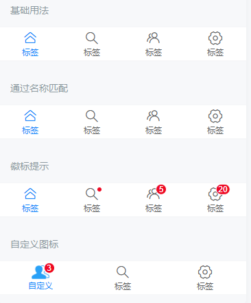
基础用法
`v-model` 默认绑定选中标签的索引值,通过修改 `v-model` 即可切换选中的标签。
通过名称匹配
在标签指定 `name` 属性的情况下,`v-model` 的值为当前标签的 `name`。
徽标提示
设置 `dot` 属性后,会在图标右上角展示一个小红点;设置 `badge` 属性后,会在图标右上角展示相应的徽标。
自定义图标
通过 `icon` 插槽自定义图标,可以通过 `slot-scope` 判断标签是否选中。
自定义颜色
监听切换事件
路由模式
标签栏支持路由模式,用于搭配 `vue-router` 使用。路由模式下会匹配页面路径和标签的 `to` 属性,并自动选中对应的标签。
API
Tabbar Props
| 参数 | 说明 | 类型 | 默认值 | |
|---|---|---|---|---|
| v-model | 当前选中标签的名称或索引值 | number / string | 0 | |
| fixed | 是否固定在底部 | boolean | true | |
| border | 是否显示外边框 | boolean | true | |
| z-index | 元素 z-index | number / string | 1 | |
| active-color | 选中标签的颜色 | string | #1989fa | |
| inactive-color | 未选中标签的颜色 | string | #7d7e80 | |
| route | 是否开启路由模式 | boolean | false | |
placeholder v2.6.0 | 固定在底部时,是否在标签位置生成一个等高的占位元素 | boolean | false | |
| safe-area-inset-bottom | 是否开启[底部安全区适配](https://youzan.github.io/vant/v2/#/zh-CN/advanced-usage#di-bu-an-quan-qu-gua-pei),设置 fixed 时默认开启 | boolean | false | |
before-change v2.10.4 | 切换标签前的回调函数,返回 false 可阻止切换,支持返回 Promise | (name) => boolean / Promise | - |
Tabbar Events
| 事件名 | 说明 | 回调参数 | |
|---|---|---|---|
| change | 切换标签时触发 | active: 当前选中标签的名称或索引值 |
TabbarItem Props
| 参数 | 说明 | 类型 | 默认值 | |
|---|---|---|---|---|
| name | 标签名称,作为匹配的标识符 | number / string | 当前标签的索引值 | |
| icon | [图标名称](https://youzan.github.io/vant/v2/#/zh-CN/icon)或图片链接 | string | - | |
icon-prefix v2.5.3 | 图标类名前缀,同 Icon 组件的 [class-prefix 属性](https://youzan.github.io/vant/v2/#/zh-CN/icon#props) | string | van-icon | |
| dot | 是否显示图标右上角小红点 | boolean | false | |
badge v2.5.6 | 图标右上角徽标的内容 | number / string | - | |
| info | 图标右上角徽标的内容(已废弃,请使用 badge 属性) | number / string | - | |
| url | 点击后跳转的链接地址 | string | - | |
| to | 点击后跳转的目标路由对象,同 vue-router 的 [to 属性](https://router.vuejs.org/zh/api/#to) | string / object | - | |
| replace | 是否在跳转时替换当前页面历史 | boolean | false |
TabbarItem Slots
| 名称 | 说明 | 参数 | |
|---|---|---|---|
| icon | 自定义图标 | active: 是否为选中标签 |
样式变量
组件提供了下列 Less 变量,可用于自定义样式,使用方法请参考
。
| 名称 | 默认值 | 描述 | |
|---|---|---|---|
| @tabbar-height | 50px | - | |
| @tabbar-z-index | 1 | - | |
| @tabbar-background-color | @white | - | |
| @tabbar-item-font-size | @font-size-sm | - | |
| @tabbar-item-text-color | @gray-7 | - | |
| @tabbar-item-active-color | @blue | - | |
| @tabbar-item-active-background-color | @tabbar-background-color | - | |
| @tabbar-item-line-height | 1 | - | |
| @tabbar-item-icon-size | 22px | - | |
| @tabbar-item-margin-bottom | 4px | - |
效果图: