介绍
商品卡片,用于展示商品的图片、价格等信息。
引入
代码演示
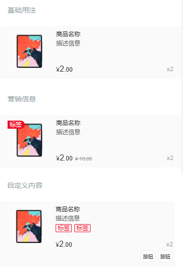
基础用法
营销信息
通过 `origin-price` 设置商品原价,通过 `tag` 设置商品左上角标签。
自定义内容
`Card` 组件提供了多个插槽,可以灵活地自定义内容。
API
Props
| 参数 | 说明 | 类型 | 默认值 | |
|---|---|---|---|---|
| thumb | 左侧图片 URL | string | - | |
| title | 标题 | string | - | |
| desc | 描述 | string | - | |
| tag | 图片角标 | string | - | |
| num | 商品数量 | number / string | - | |
| price | 商品价格 | number / string | - | |
| origin-price | 商品划线原价 | number / string | - | |
| centered | 内容是否垂直居中 | boolean | false | |
| currency | 货币符号 | string | ¥ | |
| thumb-link | 点击左侧图片后跳转的链接地址 | string | - | |
| lazy-load | 是否开启图片懒加载,须配合 [Lazyload](https://youzan.github.io/vant/v2/#/zh-CN/lazyload) 组件使用 | boolean | false |
Events
| 事件名 | 说明 | 回调参数 | |
|---|---|---|---|
| click | 点击时触发 | event: Event | |
| click-thumb | 点击自定义图片时触发 | event: Event |
Slots
| 名称 | 说明 | |
|---|---|---|
| title | 自定义标题 | |
| desc | 自定义描述 | |
| num | 自定义数量 | |
| price | 自定义价格 | |
| origin-price | 自定义商品原价 | |
| price-top | 自定义价格上方区域 | |
| bottom | 自定义价格下方区域 | |
| thumb | 自定义图片 | |
| tag | 自定义图片角标 | |
| tags | 自定义描述下方标签区域 | |
| footer | 自定义右下角内容 |
样式变量
组件提供了下列 Less 变量,可用于自定义样式,使用方法请参考
。
| 名称 | 默认值 | 描述 | |
|---|---|---|---|
| @card-padding | @padding-xs @padding-md | - | |
| @card-font-size | @font-size-sm | - | |
| @card-text-color | @text-color | - | |
| @card-background-color | @background-color-light | - | |
| @card-thumb-size | 88px | - | |
| @card-thumb-border-radius | @border-radius-lg | - | |
| @card-title-line-height | 16px | - | |
| @card-desc-color | @gray-7 | - | |
| @card-desc-line-height | @line-height-md | - | |
| @card-price-color | @gray-8 | - | |
| @card-origin-price-color | @gray-6 | - | |
| @card-num-color | @gray-6 | - | |
| @card-origin-price-font-size | @font-size-xs | - | |
| @card-price-font-size | @font-size-sm | - | |
| @card-price-integer-font-size | @font-size-lg | - | |
| @card-price-font-family | @price-integer-font-family | - |
效果图: