介绍
用于在多个选项中选择单个结果。
引入
代码演示
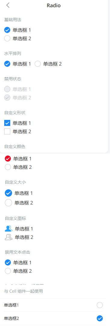
基础用法
通过 `v-model` 绑定值当前选中项的 name。
水平排列
将 `direction` 属性设置为 `horizontal` 后,单选框组会变成水平排列。
禁用状态
通过 `disabled` 属性禁止选项切换,在 `Radio` 上设置 `disabled` 可以禁用单个选项。
自定义形状
将 `shape` 属性设置为 `square`,单选框的形状会变成方形。
自定义颜色
通过 `checked-color` 属性设置选中状态的图标颜色。
自定义大小
通过 `icon-size` 属性可以自定义图标的大小。
自定义图标
通过 `icon` 插槽自定义图标,并通过 `slotProps` 判断是否为选中状态。
禁用文本点击
设置 `label-disabled` 属性后,点击图标以外的内容不会触发单选框切换。
与 Cell 组件一起使用
此时你需要再引入 `Cell` 和 `CellGroup` 组件。
API
Radio Props
| 参数 | 说明 | 类型 | 默认值 | |
|---|---|---|---|---|
| name | 标识符 | any | - | |
| shape | 形状,可选值为 square | string | round | |
| disabled | 是否为禁用状态 | boolean | false | |
| label-disabled | 是否禁用文本内容点击 | boolean | false | |
| label-position | 文本位置,可选值为 left | string | right | |
| icon-size | 图标大小,默认单位为px | number 、 string | 20px | |
| checked-color | 选中状态颜色 | string | #1989fa |
RadioGroup Props
| 参数 | 说明 | 类型 | 默认值 | |
|---|---|---|---|---|
| v-model (value) | 当前选中项的标识符 | any | - | |
| disabled | 是否禁用所有单选框 | boolean | false | |
direction v2.5.0 | 排列方向,可选值为horizontal | string | vertical | |
| icon-size | 所有单选框的图标大小,默认单位为px | number 、 string | 20px | |
| checked-color | 所有单选框的选中状态颜色 | string | #1989fa |
Radio Events
| 事件名 | 说明 | 回调参数 | |
|---|---|---|---|
| click | 点击单选框时触发 | event: Event |
RadioGroup Events
| 事件名 | 说明 | 回调参数 | |
|---|---|---|---|
| change | 当绑定值变化时触发的事件 | name: string |
Radio Slots
| 名称 | 说明 | 参数 | |
|---|---|---|---|
| default | 自定义文本 | - | |
| icon | 自定义图标 | checked: boolean |
样式变量
组件提供了下列 Less 变量,可用于自定义样式,使用方法请参考
。
| 名称 | 默认值 | 描述 | |
|---|---|---|---|
| @radio-size | 20px | - | |
| @radio-border-color | @gray-5 | - | |
| @radio-transition-duration | @animation-duration-fast | - | |
| @radio-label-margin | @padding-xs | - | |
| @radio-label-color | @text-color | - | |
| @radio-checked-icon-color | @blue | - | |
| @radio-disabled-icon-color | @gray-5 | - | |
| @radio-disabled-label-color | @gray-5 | - | |
| @radio-disabled-background-color | @border-color | - |
效果图: