介绍
在右上角展示徽标数字或小红点。
引入
代码演示
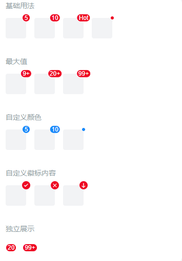
基础用法
设置 `content` 属性后,Badge 会在子元素的右上角显示对应的徽标,也可以通过 `dot` 来显示小红点。
最大值
设置 `max` 属性后,当 `content` 的数值超过最大值时,会自动显示为 `{max}+`。
自定义颜色
通过 `color` 属性来设置徽标的颜色。
自定义徽标内容
通过 `content` 插槽可以自定义徽标的内容,比如插入一个图标。
独立展示
当 Badge 没有子元素时,会作为一个独立的元素进行展示。
API
Props
| 参数 | 说明 | 类型 | 默认值 | |
|---|---|---|---|---|
| content | 徽标内容 | number / string | - | |
| color | 徽标背景颜色 | string | #ee0a24 | |
| dot | 是否展示为小红点 | boolean | false | |
| max | 最大值,超过最大值会显示 {max}+,仅当 content 为数字时有效 | number / string | - |
Slots
| 名称 | 说明 | |
|---|---|---|
| default | 徽标包裹的子元素 | |
| content | 自定义徽标内容 |
样式变量
组件提供了下列 Less 变量,可用于自定义样式,使用方法请参考
。
| 名称 | 默认值 | 描述 | |
|---|---|---|---|
| @badge-size | 16px | - | |
| @badge-color | @white | - | |
| @badge-padding | 0 3px | - | |
| @badge-font-size | @font-size-sm | - | |
| @badge-font-weight | @font-weight-bold | - | |
| @badge-border-width | @border-width-base | - | |
| @badge-background-color | @red | - | |
| @badge-dot-color | @red | - | |
| @badge-dot-size | 8px | - | |
| @badge-font-family | -apple-system-font, Helvetica Neue, Arial, sans-serif | - |
效果图: