介绍
弹出式的气泡菜单,2.11 版本开始支持此组件。
引入
代码演示
基础用法
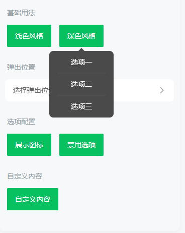
当 Popover 弹出时,会基于 `reference` 插槽的内容进行定位。
深色风格
Popover 支持浅色和深色两种风格,默认为浅色风格,将 `theme` 属性设置为 `dark` 可切换为深色风格。
弹出位置
通过 `placement` 属性来控制气泡的弹出位置。
`placement` 支持以下值:
展示图标
在 `actions` 数组中,可以通过 `icon` 字段来定义选项的图标,支持传入
或图片链接。
禁用选项
在 `actions` 数组中,可以通过 `disabled` 字段来禁用某个选项。
自定义内容
通过默认插槽,可以在 Popover 内部放置任意内容。
> 注意:使用 get-container 时,挂载的父节点不可以是 popover 的 reference slot 节点
API
Props
| 参数 | 说明 | 类型 | 默认值 | |
|---|---|---|---|---|
| v-model | 是否展示气泡弹出层 | boolean | false | |
| actions | 选项列表 | Action[] | [] | |
| placement | 弹出位置 | string | bottom | |
| theme | 主题风格,可选值为 dark | string | light | |
trigger v2.11.1 | 触发方式,可选值为 click | - | ||
| offset | 出现位置的偏移量 | [number, number] | [0, 8] | |
| overlay | 是否显示遮罩层 | boolean | false | |
| close-on-click-action | 是否在点击选项后关闭 | boolean | true | |
| close-on-click-outside | 是否在点击外部元素后关闭菜单 | boolean | true | |
| get-container | 指定挂载的节点,[用法示例](https://youzan.github.io/vant/v2/#/zh-CN/popup#zhi-ding-gua-zai-wei-zhi) | string / () => Element | body |
Action 数据结构
`actions` 属性是一个由对象构成的数组,数组中的每个对象配置一列,对象可以包含以下值:
| 键名 | 说明 | 类型 | |
|---|---|---|---|
| text | 选项文字 | string | |
| icon | 文字左侧的图标,支持传入[图标名称](https://youzan.github.io/vant/v2/#/zh-CN/icon)或图片链接 | string | |
| disabled | 是否为禁用状态 | boolean | |
| className | 为对应选项添加额外的类名 | any |
Events
| 事件名 | 说明 | 回调参数 | |
|---|---|---|---|
| select | 点击选项时触发 | action: Action, index: number | |
| open | 打开菜单时触发 | - | |
| close | 关闭菜单时触发 | - | |
| opened | 打开菜单且动画结束后触发 | - | |
| closed | 关闭菜单且动画结束后触发 | - |
Slots
| 名称 | 说明 | |
|---|---|---|
| default | 自定义菜单内容 | |
| reference | 触发 Popover 显示的元素内容 |
样式变量
组件提供了下列 Less 变量,可用于自定义样式,使用方法请参考
。
| 名称 | 默认值 | 描述 | |
|---|---|---|---|
| @popover-arrow-size | 6px | - | |
| @popover-border-radius | @border-radius-lg | - | |
| @popover-action-width | 128px | - | |
| @popover-action-height | 44px | - | |
| @popover-action-font-size | @font-size-md | - | |
| @popover-action-line-height | @line-height-md | - | |
| @popover-action-icon-size | 20px | - | |
| @popover-light-text-color | @text-color | - | |
| @popover-light-background-color | @white | - | |
| @popover-light-action-disabled-text-color | @gray-5 | - | |
| @popover-dark-text-color | @white | - | |
| @popover-dark-background-color | #4a4a4a | - | |
| @popover-dark-action-disabled-text-color | @gray-6 | - |
常见问题
Popover 的点击事件无法正确触发?
这种情况通常是由于项目中引入了 `fastclick` 库导致的。建议移除 `fastclick`,或者配置 `fastclick` 的
。
效果图: