引入
代码演示
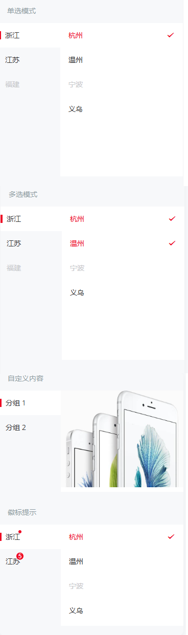
单选模式
`item` 为分类显示所需的数据,数据格式见下方示例。`main-active-index` 表示左侧高亮选项的索引,`active-id` 表示右侧高亮选项的 id。
多选模式
`active-id` 为数组格式时,可以选中多个右侧选项。
自定义内容
通过 `content` 插槽可以自定义右侧区域的内容。
徽标提示
设置 `dot` 属性后,会在图标右上角展示一个小红点;设置 `badge` 属性后,会在图标右上角展示相应的徽标。
API
Props
| 参数 | 说明 | 类型 | 默认值 | |
|---|---|---|---|---|
| items | 分类显示所需的数据 | Item[] | [] | |
| height | 高度,默认单位为px | number / string | 300 | |
| main-active-index | 左侧选中项的索引 | number / string | 0 | |
| active-id | 右侧选中项的 id,支持传入数组 | number / string /(number / string)[] | 0 | |
| max | 右侧项最大选中个数 | number / string | Infinity | |
selected-icon v2.9.0 | 自定义右侧栏选中状态的图标 | string | success |
Events
| 事件名 | 说明 | 回调参数 | |
|---|---|---|---|
| click-nav | 点击左侧导航时触发 | index:被点击的导航的索引 | |
| click-item | 点击右侧选择项时触发 | data: 该点击项的数据 |
Slots
| 名称 | 说明 | |
|---|---|---|
| content | 自定义右侧区域内容 |
Item 数据结构
`items` 整体为一个数组,数组内包含一系列描述分类的对象,每个分类里,`text`表示当前分类的名称,`children`表示分类里的可选项。
样式变量
组件提供了下列 Less 变量,可用于自定义样式,使用方法请参考
。
| 名称 | 默认值 | 描述 | |
|---|---|---|---|
| @tree-select-font-size | @font-size-md | - | |
| @tree-select-nav-background-color | @background-color | - | |
| @tree-select-content-background-color | @white | - | |
| @tree-select-nav-item-padding | 14px @padding-sm | - | |
| @tree-select-item-height | 48px | - | |
| @tree-select-item-active-color | @red | - | |
| @tree-select-item-disabled-color | @gray-5 | - | |
| @tree-select-item-selected-size | 16px | - |
效果图: