介绍
按钮用于触发一个操作,如提交表单。
引入
代码演示
按钮类型
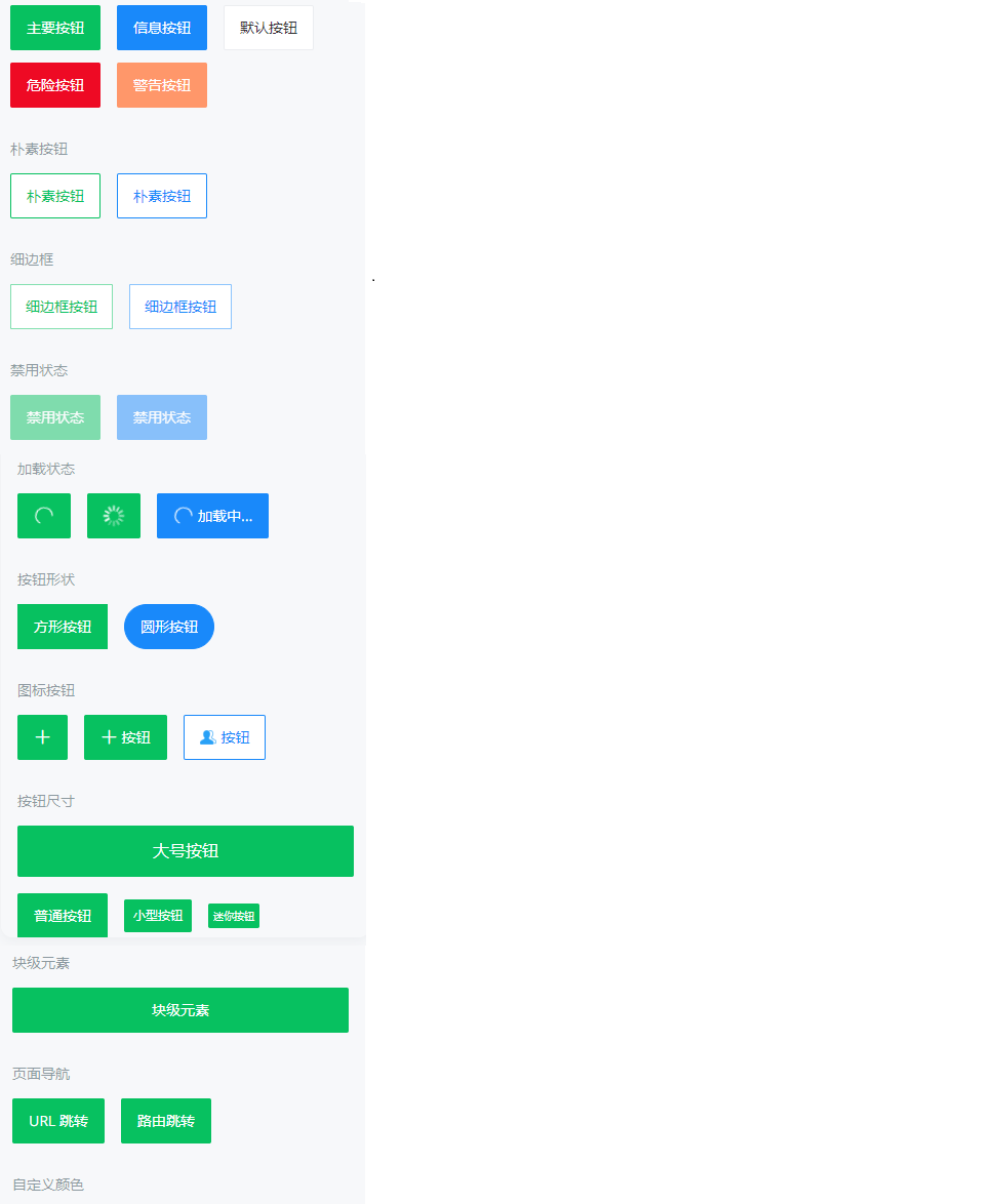
按钮支持 `default`、`primary`、`info`、`warning`、`danger` 五种类型,默认为 `default`。
朴素按钮
通过 `plain` 属性将按钮设置为朴素按钮,朴素按钮的文字为按钮颜色,背景为白色。
细边框
设置 `hairline` 属性可以展示 0.5px 的细边框。
禁用状态
通过 `disabled` 属性来禁用按钮,禁用状态下按钮不可点击。
加载状态
通过 `loading` 属性设置按钮为加载状态,加载状态下默认会隐藏按钮文字,可以通过 `loading-text` 设置加载状态下的文字。
按钮形状
通过 `square` 设置方形按钮,通过 `round` 设置圆形按钮。
图标按钮
通过 `icon` 属性设置按钮图标,支持 Icon 组件里的所有图标,也可以传入图标 URL。
按钮尺寸
支持 `large`、`normal`、`small`、`mini` 四种尺寸,默认为 `normal`。
块级元素
按钮在默认情况下为行内块级元素,通过 `block` 属性可以将按钮的元素类型设置为块级元素。
页面导航
可以通过 `url` 属性进行 URL 跳转,或通过 `to` 属性进行路由跳转。
自定义颜色
通过 `color` 属性可以自定义按钮的颜色。
API
Props
| 参数 | 说明 | 类型 | 默认值 | ||
|---|---|---|---|---|---|
| type | 类型,可选值为 primary info warning danger | string | default | ||
| size | 尺寸,可选值为 large small mini | string | normal | ||
| text | 按钮文字 | string | - | ||
| color | 按钮颜色,支持传入 linear-gradient 渐变色 | string | - | ||
| icon | 左侧[图标名称](https://youzan.github.io/vant/v2/#/zh-CN/icon)或图片链接 | string | - | ||
icon-prefix v2.6.0 | 图标类名前缀,同 Icon 组件的 [class-prefix 属性](https://youzan.github.io/vant/v2/#/zh-CN/icon#props) | string | van-icon | ||
icon-position v2.10.7 | 图标展示位置,可选值为 right | string | left | ||
| tag | 按钮根节点的 HTML 标签 | string | button | ||
| native-type | 原生 button 标签的 type 属性 | string | - | ||
| block | 是否为块级元素 | boolean | false | ||
| plain | 是否为朴素按钮 | boolean | false | ||
| square | 是否为方形按钮 | boolean | false | ||
| round | 是否为圆形按钮 | boolean | false | ||
| disabled | 是否禁用按钮 | boolean | false | ||
| hairline | 是否使用 0.5px 边框 | boolean | false | ||
| loading | 是否显示为加载状态 | boolean | false | ||
| loading-text | 加载状态提示文字 | string | - | ||
| loading-type | [加载图标类型](https://youzan.github.io/vant/v2/#/zh-CN/loading),可选值为 spinner | string | circular | ||
| loading-size | 加载图标大小 | string | 20px | ||
| url | 点击后跳转的链接地址 | string | - | ||
| to | 点击后跳转的目标路由对象,同 vue-router 的 [to 属性](https://router.vuejs.org/zh/api/#to) | *string | object* | - | |
| replace | 是否在跳转时替换当前页面历史 | boolean | false |
Events
| 事件名 | 说明 | 回调参数 | |
|---|---|---|---|
| click | 点击按钮,且按钮状态不为加载或禁用时触发 | event: Event | |
| touchstart | 开始触摸按钮时触发 | event: TouchEvent |
Slots
| 名称 | 说明 | |
|---|---|---|
| default | 按钮内容 | |
icon v2.12.21 | 自定义图标 | |
loading v2.10.1 | 自定义加载图标 |
样式变量
组件提供了下列 Less 变量,可用于自定义样式,使用方法请参考
。
| 名称 | 默认值 | 描述 | |
|---|---|---|---|
| @button-mini-height | 24px | - | |
| @button-mini-font-size | @font-size-xs | - | |
| @button-small-height | 32px | - | |
| @button-small-font-size | @font-size-sm | - | |
| @button-normal-font-size | @font-size-md | - | |
| @button-large-height | 50px | - | |
| @button-default-height | 44px | - | |
| @button-default-line-height | 1.2 | - | |
| @button-default-font-size | @font-size-lg | - | |
| @button-default-color | @text-color | - | |
| @button-default-background-color | @white | - | |
| @button-default-border-color | @border-color | - | |
| @button-primary-color | @white | - | |
| @button-primary-background-color | @green | - | |
| @button-primary-border-color | @green | - | |
| @button-info-color | @white | - | |
| @button-info-background-color | @blue | - | |
| @button-info-border-color | @blue | - | |
| @button-danger-color | @white | - | |
| @button-danger-background-color | @red | - | |
| @button-danger-border-color | @red | - | |
| @button-warning-color | @white | - | |
| @button-warning-background-color | @orange | - | |
| @button-warning-border-color | @orange | - | |
| @button-border-width | @border-width-base | - | |
| @button-border-radius | @border-radius-sm | - | |
| @button-round-border-radius | @border-radius-max | - | |
| @button-plain-background-color | @white | - | |
| @button-disabled-opacity | @disabled-opacity | - |
图片效果: