介绍
可以左右滑动来展示操作按钮的单元格组件。
引入
代码演示
基础用法
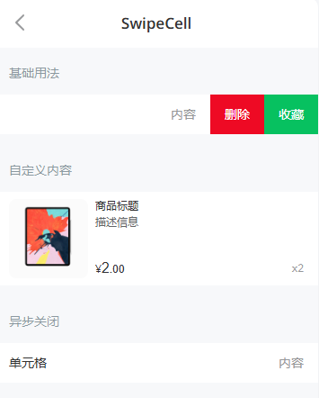
`SwipeCell` 组件提供了 `left` 和 `right` 两个插槽,用于定义两侧滑动区域的内容。
自定义内容
`SwipeCell` 可以嵌套任意内容,比如嵌套一个商品卡片。
异步关闭
通过传入 `before-close` 回调函数,可以自定义两侧滑动内容关闭时的行为。
API
Props
| 参数 | 说明 | 类型 | 默认值 | |
|---|---|---|---|---|
| name | 标识符,可以在事件参数中获取到 | number / string | - | |
| left-width | 指定左侧滑动区域宽度,单位为px | number / string | auto | |
| right-width | 指定右侧滑动区域宽度,单位为px | number / string | auto | |
| before-close | 关闭前的回调函数 | Function | - | |
| disabled | 是否禁用滑动 | boolean | false | |
| stop-propagation | 是否阻止滑动事件冒泡 | boolean | false |
Slots
| 名称 | 说明 | |
|---|---|---|
| default | 自定义显示内容 | |
| left | 左侧滑动内容 | |
| right | 右侧滑动内容 |
Events
| 事件名 | 说明 | 回调参数 | |
|---|---|---|---|
| click | 点击时触发 | 关闭时的点击位置 (left right cell outside) | |
| open | 打开时触发 | { position: 'left' / 'right' , name: string } | |
| close | 关闭时触发 | { position: string , name: string } |
beforeClose 参数
beforeClose 的第一个参数为对象,对象中包含以下属性:
| 参数名 | 说明 | 类型 | |
|---|---|---|---|
| name | 标识符 | string | |
| position | 关闭时的点击位置 (left right cell outside) | string | |
| instance | SwipeCell 实例,用于调用实例方法 | SwipeCell |
方法
通过 ref 可以获取到 SwipeCell 实例并调用实例方法,详见
。
| 方法名 | 说明 | 参数 | 返回值 | |
|---|---|---|---|---|
| open | 打开单元格侧边栏 | position: left \/ right | - | |
| close | 收起单元格侧边栏 | - | - |
样式变量
组件提供了下列 Less 变量,可用于自定义样式,使用方法请参考
。
| 名称 | 默认值 | 描述 | |
|---|---|---|---|
| @switch-cell-padding-top | @cell-vertical-padding - 1px | - | |
| @switch-cell-padding-bottom | @cell-vertical-padding - 1px | - | |
| @switch-cell-large-padding-top | @cell-large-vertical-padding - 1px | - | |
| @switch-cell-large-padding-bottom | @cell-large-vertical-padding - 1px | - |
常见问题
在桌面端无法操作组件?
参见
。
效果图: